Designing trust at first contact: Introducing Aiko, MaNaDr's AI health companion
MaNaDr is a B2C healthcare platform serving patients in Singapore. When the team decided to introduce an AI agent into the patient app, the brief was straightforward on the surface: make it interactive, make it friendly, and drive adoption. What followed was a much more layered design challenge — one that was less about building a chatbot and more about designing the conditions under which patients would be willing to trust an AI with their health at all.
90%
Users landed in the Aiko chat and had a first interaction
60%
Continued actively using Aiko beyond their first session
15%
of teleconsult requests were initialized through Aiko
Role
Lead Product DesignerUser ResearchUI/UX
Team
MePM&POMobile TeamBackend Team
Timeline
2025 Q2

Problems
The harder question underneath it
The brief was simple: introduce an AI agent, make it friendly, drive adoption. The harder question was underneath it. MaNaDr is built on doctor-patient trust. Introducing AI into that context carries a risk most product launches don't: patients might read it as the platform moving away from the humans they came here for.
So before we designed Aiko, we had to answer something more fundamental:
Would patients accept an AI agent in their healthcare, and would they understand it as support, not a replacement?
What research told us
User interviews and competitive research revealed something that changed the direction of the entire project. Patients weren't simply skeptical of AI in the abstract. They had already formed a coherent, specific mental model of where AI belonged in their healthcare journey, and where it didn't.
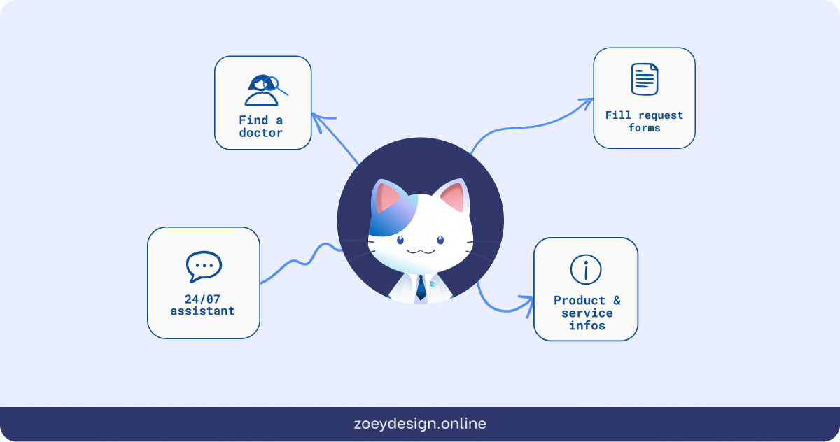
AI was acceptable for administrative work: finding a doctor, understanding a prescription, filling out request details, navigating the platform. But for anything that touched clinical judgment like consultation, diagnosis, treatment decisions, patients wanted a human.
The real challenge wasn't making Aiko impressive. It was making sure patients understood exactly what Aiko was and wasn't the moment they encountered it.
Three decisions that shaped the Aiko experience
01. Making Aiko visible without disrupting what already existed
The MaNaDr homescreen was already dense, and restructuring the layout wasn't an option — any navigation change would have delayed launch. Instead, Aiko was introduced as a floating avatar anchored to the bottom-right corner, persistent and alive but non-disruptive, with a contextual speech bubble giving it a voice without claiming dedicated screen real estate.
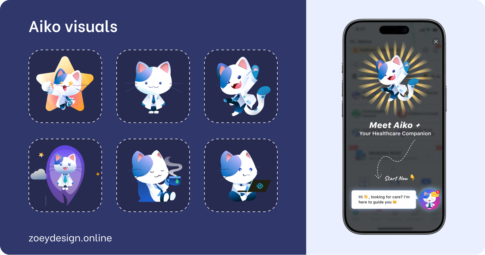
The bigger challenge was visual cohesion: placing a polished, gradient-rich character into an inconsistent app risked making Aiko look out of place. To solve this, Aiko's design was anchored to the app's primary blue and drawn from the existing doctor cat mascot, giving her a visual lineage inside the product. Then, to bring the homescreen up to meet her, the full service icon collection was updated to match her gradient palette (a refresh that wasn't in the original brief, but became unavoidable once Aiko's visual direction was set).
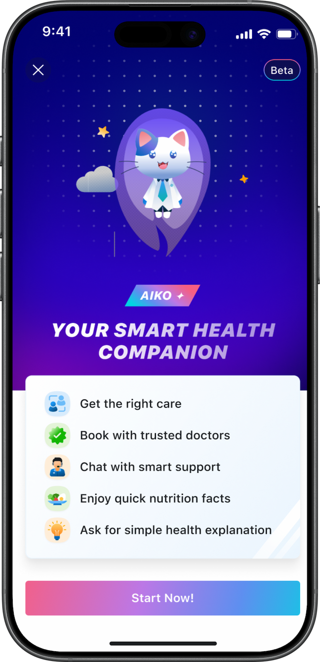
On first launch, a single full-screen splash introduced her: Aiko mid-leap, "Your Healthcare Companion," one CTA. No walkthrough, no multi-step onboarding, just a warm entrance that was enough to onboard 90% of existing users into the new feature.
02. Designing for latency: Animated states and The minigame
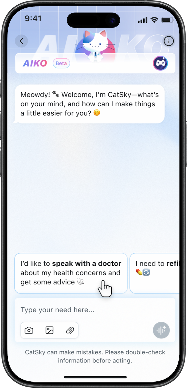
AI response latency was high in V1, and silence in a chat product reads as broken. Rather than accept that, we designed three animated states in RIVE (isIdle, isThinking, isChilling), each mapped to a real conversational moment.
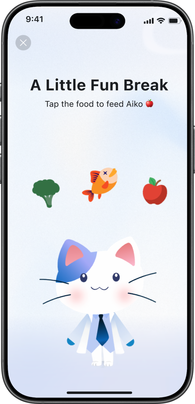
But even with animation, latency was long enough that users risked leaving. So with Leo (other designer in the team), we designed a minigame — medically-themed vitality items users could feed to Aiko while waiting, turning the dead time into a character moment. Users weren't waiting for a response. They were taking care of their companion.
03. Setting the right expectations
One of the quietest but most important design decisions was how we shaped users' mental model of Aiko before they typed a single message. The floating bubble on the homescreen carried a contextual prompt — a soft nudge that signaled Aiko was ready and approachable. Inside the chat, pre-written scenario suggestions showed users the kinds of questions they could ask, reducing the anxiety of a blank input and implicitly communicating what Aiko was there for. Together, these cues did three things:
- Lowered the barrier to a first interaction,
- Set a realistic scope for what Aiko could help with,
- Kept users from expecting something Aiko wasn't designed to be.
Tradeoffs
What we chose not to solve in V1 and why
Singapore's medical regulations require patients to complete multiple consent and information steps before a teleconsult request can be submitted (collection location for emergency, Identity process, reasons for consult…). This created an unavoidable friction point inside a feature that was designed to feel effortless.
What we prioritised
Concept validation and speed to market. Getting Aiko in front of real users quickly so we could collect behavioral data no prototype could give us.
What we deferred
UX optimization of the teleconsult request flow, edge cases in the fee model, and the gap between the current product state and Aiko's intended long-term experience.
There was also a real tension between the product's current architecture and the vision for what Aiko could be. The platform wasn't designed to absorb a feature of this ambition cleanly, and rather than designing around that gap in ways that would create technical debt or confuse users, we scoped V1 deliberately as an observation phase. Ship the concept. Watch how people actually behave. Use that data to close the gap in V2 with evidence, not assumptions.
Closing
Through research, I found that patients had already decided where AI belonged in their care journey: useful for administration, not for clinical judgment. Rather than fighting that boundary, we designed Aiko to live precisely within it, building a character-driven companion whose onboarding, homescreen presence, animated states, and interaction system all reinforced a consistent, calibrated promise. The result was 90% first-interaction adoption and 60% active usage within three months, with a 15% teleconsult conversion rate through a flow we hadn't even optimized yet. V1 was never meant to be perfect. It was meant to prove the concept was worth building, and to generate the behavioral signal we needed to build it right.


Designing trust at first contact: Introducing Aiko, MaNaDr's AI health companion
MaNaDr is a B2C healthcare platform serving patients in Singapore. When the team decided to introduce an AI agent into the patient app, the brief was straightforward on the surface: make it interactive, make it friendly, and drive adoption. What followed was a much more layered design challenge — one that was less about building a chatbot and more about designing the conditions under which patients would be willing to trust an AI with their health at all.
90%
Users landed in the Aiko chat and had a first interaction
60%
Continued actively using Aiko beyond their first session
15%
of teleconsult requests were initialized through Aiko
Role
Lead Product DesignerUser ResearchUI/UX
Team
MePM&POMobile TeamBackend Team
Timeline
2025 Q2
Problems
The harder question underneath it
The brief was simple: introduce an AI agent, make it friendly, drive adoption. The harder question was underneath it. MaNaDr is built on doctor-patient trust. Introducing AI into that context carries a risk most product launches don't: patients might read it as the platform moving away from the humans they came here for.
So before we designed Aiko, we had to answer something more fundamental:
Would patients accept an AI agent in their healthcare, and would they understand it as support, not a replacement?
What research told us
User interviews and competitive research revealed something that changed the direction of the entire project. Patients weren't simply skeptical of AI in the abstract. They had already formed a coherent, specific mental model of where AI belonged in their healthcare journey, and where it didn't.
AI was acceptable for administrative work: finding a doctor, understanding a prescription, filling out request details, navigating the platform. But for anything that touched clinical judgment like consultation, diagnosis, treatment decisions, patients wanted a human.
The real challenge wasn't making Aiko impressive. It was making sure patients understood exactly what Aiko was and wasn't the moment they encountered it.
Three decisions that shaped the Aiko experience
01. Making Aiko visible without disrupting what already existed
The MaNaDr homescreen was already dense, and restructuring the layout wasn't an option — any navigation change would have delayed launch. Instead, Aiko was introduced as a floating avatar anchored to the bottom-right corner, persistent and alive but non-disruptive, with a contextual speech bubble giving it a voice without claiming dedicated screen real estate.
The bigger challenge was visual cohesion: placing a polished, gradient-rich character into an inconsistent app risked making Aiko look out of place. To solve this, Aiko's design was anchored to the app's primary blue and drawn from the existing doctor cat mascot, giving her a visual lineage inside the product. Then, to bring the homescreen up to meet her, the full service icon collection was updated to match her gradient palette (a refresh that wasn't in the original brief, but became unavoidable once Aiko's visual direction was set).
On first launch, a single full-screen splash introduced her: Aiko mid-leap, "Your Healthcare Companion," one CTA. No walkthrough, no multi-step onboarding, just a warm entrance that was enough to onboard 90% of existing users into the new feature.
02. Designing for latency: Animated states and The minigame
AI response latency was high in V1, and silence in a chat product reads as broken. Rather than accept that, we designed three animated states in RIVE (isIdle, isThinking, isChilling), each mapped to a real conversational moment.
But even with animation, latency was long enough that users risked leaving. So with Leo (other designer in the team), we designed a minigame — medically-themed vitality items users could feed to Aiko while waiting, turning the dead time into a character moment. Users weren't waiting for a response. They were taking care of their companion.
03. Setting the right expectations
One of the quietest but most important design decisions was how we shaped users' mental model of Aiko before they typed a single message. The floating bubble on the homescreen carried a contextual prompt — a soft nudge that signaled Aiko was ready and approachable. Inside the chat, pre-written scenario suggestions showed users the kinds of questions they could ask, reducing the anxiety of a blank input and implicitly communicating what Aiko was there for. Together, these cues did three things:
- Lowered the barrier to a first interaction,
- Set a realistic scope for what Aiko could help with,
- Kept users from expecting something Aiko wasn't designed to be.
Tradeoffs
What we chose not to solve in V1 and why
Singapore's medical regulations require patients to complete multiple consent and information steps before a teleconsult request can be submitted (collection location for emergency, Identity process, reasons for consult…). This created an unavoidable friction point inside a feature that was designed to feel effortless.
What we prioritised
Concept validation and speed to market. Getting Aiko in front of real users quickly so we could collect behavioral data no prototype could give us.
What we deferred
UX optimization of the teleconsult request flow, edge cases in the fee model, and the gap between the current product state and Aiko's intended long-term experience.
There was also a real tension between the product's current architecture and the vision for what Aiko could be. The platform wasn't designed to absorb a feature of this ambition cleanly, and rather than designing around that gap in ways that would create technical debt or confuse users, we scoped V1 deliberately as an observation phase. Ship the concept. Watch how people actually behave. Use that data to close the gap in V2 with evidence, not assumptions.
Closing
Through research, I found that patients had already decided where AI belonged in their care journey: useful for administration, not for clinical judgment. Rather than fighting that boundary, we designed Aiko to live precisely within it, building a character-driven companion whose onboarding, homescreen presence, animated states, and interaction system all reinforced a consistent, calibrated promise. The result was 90% first-interaction adoption and 60% active usage within three months, with a 15% teleconsult conversion rate through a flow we hadn't even optimized yet. V1 was never meant to be perfect. It was meant to prove the concept was worth building, and to generate the behavioral signal we needed to build it right.