Designing for the gap: UI/UX for multi-clinic awareness
MaNaDr's teleconsult product was originally built on a one doctor, one clinic model. As doctors began operating across multiple clinics, the system had no way to reflect that, creating blind spots in request coverage, especially for the pool consultation model where missed requests meant patients left without a doctor. In two weeks as the sole designer, I redesigned the clinic switching and notification model to give doctors full cross-clinic visibility without increasing the cognitive load of an interface they already knew by heart.
100%
Adoption rate: every doctor transitioned without a rollback request
100%
Pool request coverage maintained post-release
0
Support tickets raised after launch


Role
Product Designer
Team
MePM & POFront-end TeamMobile Team
Timeline
2 weeks

Problems
The system had been architected on a one doctor, one clinic assumption. There was no workspace layer, no unified inbox, and no global notification model. At the same time, the teleconsult product runs on two distinct consultation models. The direct model handles patients booked to a specific clinic. The pool model surfaces open requests that any available doctor can claim. Each carries different urgency and different notification stakes.
The tension was not only UX versus technical constraints. It was also about cognitive load. Doctors had framed this as a simple request. Delivering something that felt like a redesign would have damaged their confidence in the product team, even if the underlying solution was technically stronger.
How do we surface context from multiple clinics, including pool requests, without changing an interface that doctors already used and do not want to relearn?
Design process
Look for existing mental models
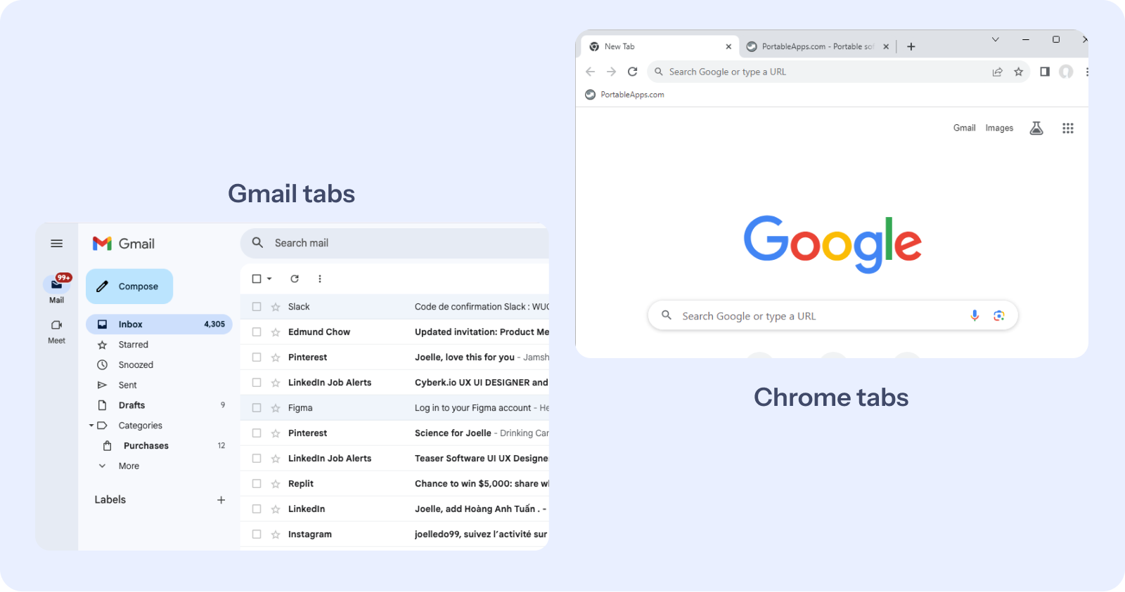
Before exploring solutions, I looked at how people already manage multiple contexts in tools they use every day. Gmail, Chrome, Messenger and Telegram all solve the same underlying problem: one user, multiple active contexts, no loss of orientation. In every case the pattern is identical. A lightweight switching layer sits above the content, the content updates underneath, and the user never loses their place. Doctors already understood this model from outside of work. The solution did not need to introduce a new interaction paradigm. It needed to borrow one they already knew.
Solve for the workspace constraint
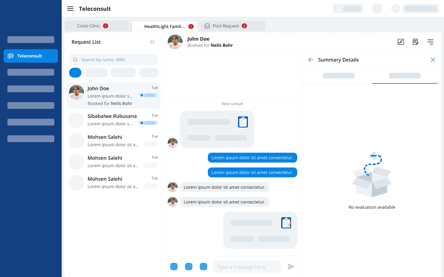
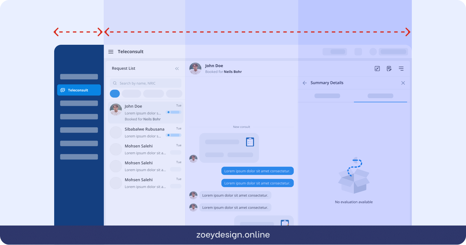
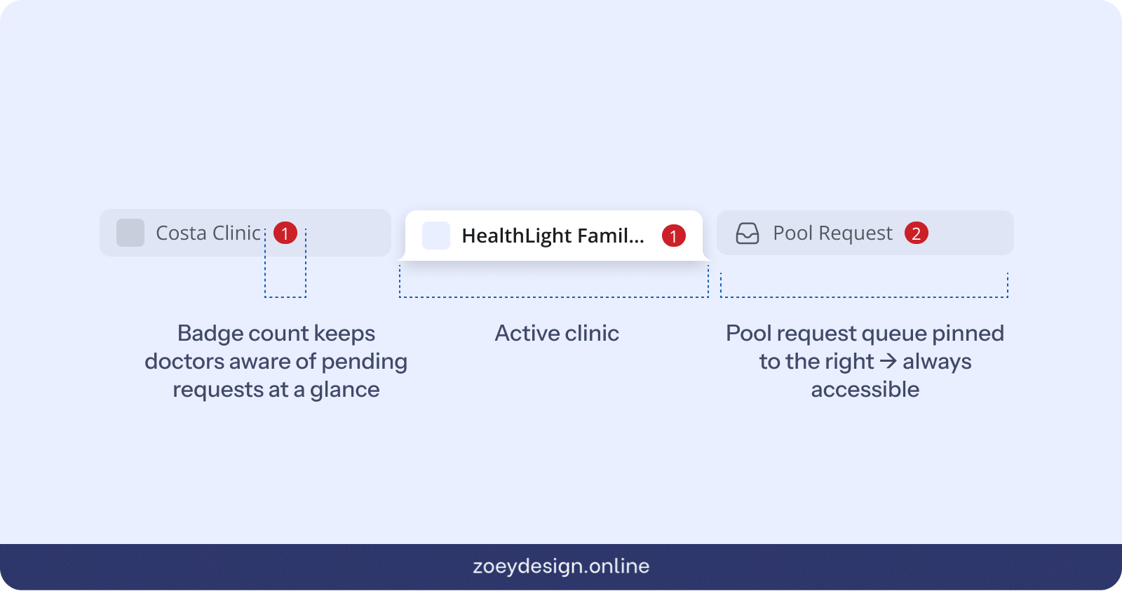
Knowing the mental model pointed me toward a horizontal switching pattern, but the layout constraint confirmed it. Doctors frequently split their screen or minimise the Doctor DB tab to reference other tools mid-consultation. Any navigation that consumed vertical space would shrink the workspace they depended on. A sidebar or vertical menu was ruled out entirely. A horizontal contextual tab switcher at the top of the teleconsult view kept the full workspace intact below it.
Anchor the Pool Request
The pool consultation queue presented a separate problem. Unlike clinic tabs, it is not tied to any single clinic context. A doctor needs to be able to see and act on pool requests regardless of which clinic tab they are currently in. I anchored the pool queue as a pinned tab on the right side of the tab bar, visually separated from the clinic tabs. This gave doctors persistent access to the pool queue at all times without interrupting their active clinic context. It also reinforced an important conceptual distinction: direct consultations belong to a clinic, pool requests belong to no clinic in particular.
Closing
Validate through zero friction
In this project, the most telling metric was the one that never appeared. No complaints, no retraining requests, no missed pool requests reported. In UX, zero friction is not the absence of a result. It is the result. When a new feature ships and doctors simply use it without noticing the change, that is the highest signal a designer can get that the mental model was right from the start.


Designing for the gap: UI/UX for multi-clinic awareness
MaNaDr's teleconsult product was originally built on a one doctor, one clinic model. As doctors began operating across multiple clinics, the system had no way to reflect that, creating blind spots in request coverage, especially for the pool consultation model where missed requests meant patients left without a doctor. In two weeks as the sole designer, I redesigned the clinic switching and notification model to give doctors full cross-clinic visibility without increasing the cognitive load of an interface they already knew by heart.
100%
Adoption rate: every doctor transitioned without a rollback request
100%
Pool request coverage maintained post-release
0
Support tickets raised after launch
Role
Product Designer
Team
MePM & POFront-end TeamMobile Team
Timeline
2 weeks
Problems
The system had been architected on a one doctor, one clinic assumption. There was no workspace layer, no unified inbox, and no global notification model. At the same time, the teleconsult product runs on two distinct consultation models. The direct model handles patients booked to a specific clinic. The pool model surfaces open requests that any available doctor can claim. Each carries different urgency and different notification stakes.
The tension was not only UX versus technical constraints. It was also about cognitive load. Doctors had framed this as a simple request. Delivering something that felt like a redesign would have damaged their confidence in the product team, even if the underlying solution was technically stronger.
How do we surface context from multiple clinics, including pool requests, without changing an interface that doctors already used and do not want to relearn?
Design process
Look for existing mental models
Before exploring solutions, I looked at how people already manage multiple contexts in tools they use every day. Gmail, Chrome, Messenger and Telegram all solve the same underlying problem: one user, multiple active contexts, no loss of orientation. In every case the pattern is identical. A lightweight switching layer sits above the content, the content updates underneath, and the user never loses their place. Doctors already understood this model from outside of work. The solution did not need to introduce a new interaction paradigm. It needed to borrow one they already knew.
Solve for the workspace constraint
Knowing the mental model pointed me toward a horizontal switching pattern, but the layout constraint confirmed it. Doctors frequently split their screen or minimise the Doctor DB tab to reference other tools mid-consultation. Any navigation that consumed vertical space would shrink the workspace they depended on. A sidebar or vertical menu was ruled out entirely. A horizontal contextual tab switcher at the top of the teleconsult view kept the full workspace intact below it.
Anchor the Pool Request
The pool consultation queue presented a separate problem. Unlike clinic tabs, it is not tied to any single clinic context. A doctor needs to be able to see and act on pool requests regardless of which clinic tab they are currently in. I anchored the pool queue as a pinned tab on the right side of the tab bar, visually separated from the clinic tabs. This gave doctors persistent access to the pool queue at all times without interrupting their active clinic context. It also reinforced an important conceptual distinction: direct consultations belong to a clinic, pool requests belong to no clinic in particular.
Closing
Validate through zero friction
In this project, the most telling metric was the one that never appeared. No complaints, no retraining requests, no missed pool requests reported. In UX, zero friction is not the absence of a result. It is the result. When a new feature ships and doctors simply use it without noticing the change, that is the highest signal a designer can get that the mental model was right from the start.