Rebuilding a healthcare design system for AI-ready delivery
The CMS is a clinical tool designed for doctors. But for years, it shared a design system with products that had nothing in common with it. Designers patched the gaps locally, quietly building a second system in the shadows. By the time we inherited it, nobody knew what existed, where it lived, or whether it could scale. So we rebuilt it from the ground up, with a team of 2 and AI doing the heavy lifting on audit and measurement.
27 → 83
Design System Health Score
80%
Consistency Score
23.96% → 90%
Design System adoption rate
Role
Design SystemStrategy & systems thinkingAI-assisted workflow
Team
2 Designers (Joelle & Leo)PM & POFront-end Team
Timeline
8 weeks

Problems
The CMS at MaNaDr isn't a typical product. Its primary users are doctors — clinicians who multitask constantly, scan dense information at speed, and switch between devices mid-consultation. Their interaction patterns, visual expectations, and tolerance for ambiguity are fundamentally different from a standard consumer interface.
But the design system didn't reflect this. The CMS shared a library with the company's other products — including a public-facing website with entirely different design conventions, information density, and interaction patterns. Two products with nothing in common as experiences were treated as one system.
In practice, no team had the bandwidth or authority to fix this. So designers patched locally — creating components on the fly, building outside the shared library, storing everything in a way only the person who built it could navigate. Over time, the CMS accumulated a shadow design system: duplicated components, no naming convention, no structure, invisible to anyone new.
Our process
A team of 2 with AI
With only two designers and a product launch deadline, we split clearly by leverage. I owned everything upstream: diagnosis, architecture, and the structural decisions that would determine how the system scaled. Leo owned downstream execution: translating those decisions into a built, published component library, because he knows the system more than me.
AI wasn't optional, it was how a team of 2 did the work of a team of 5. We used Claude Code with Figma MCP to run the audit, scan the live file, and re-measure progress at the end of Phase 1. Without it, the audit phase alone would have taken weeks of manual review.
Step 1: Audit with AI + Cross-functional survey
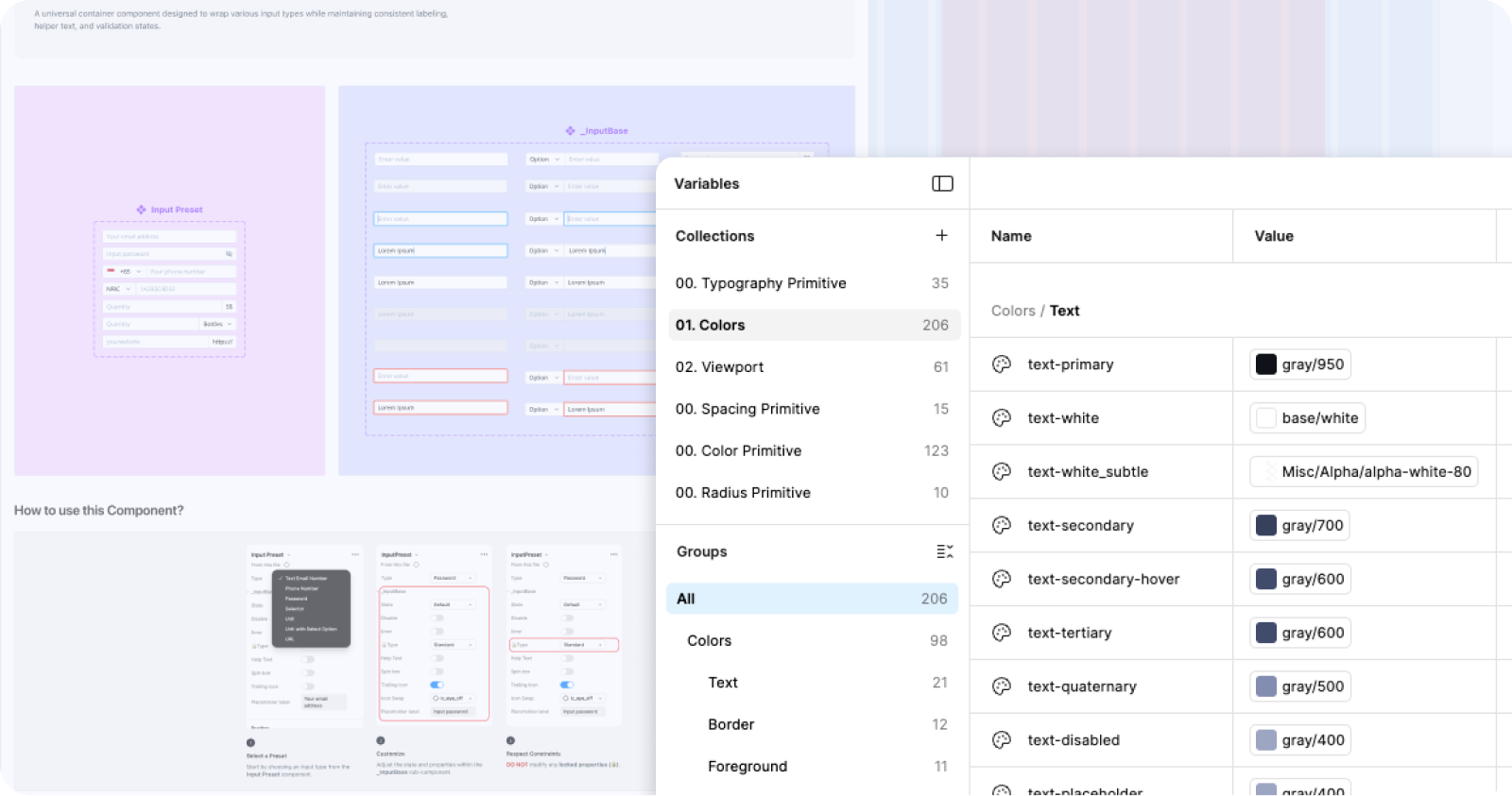
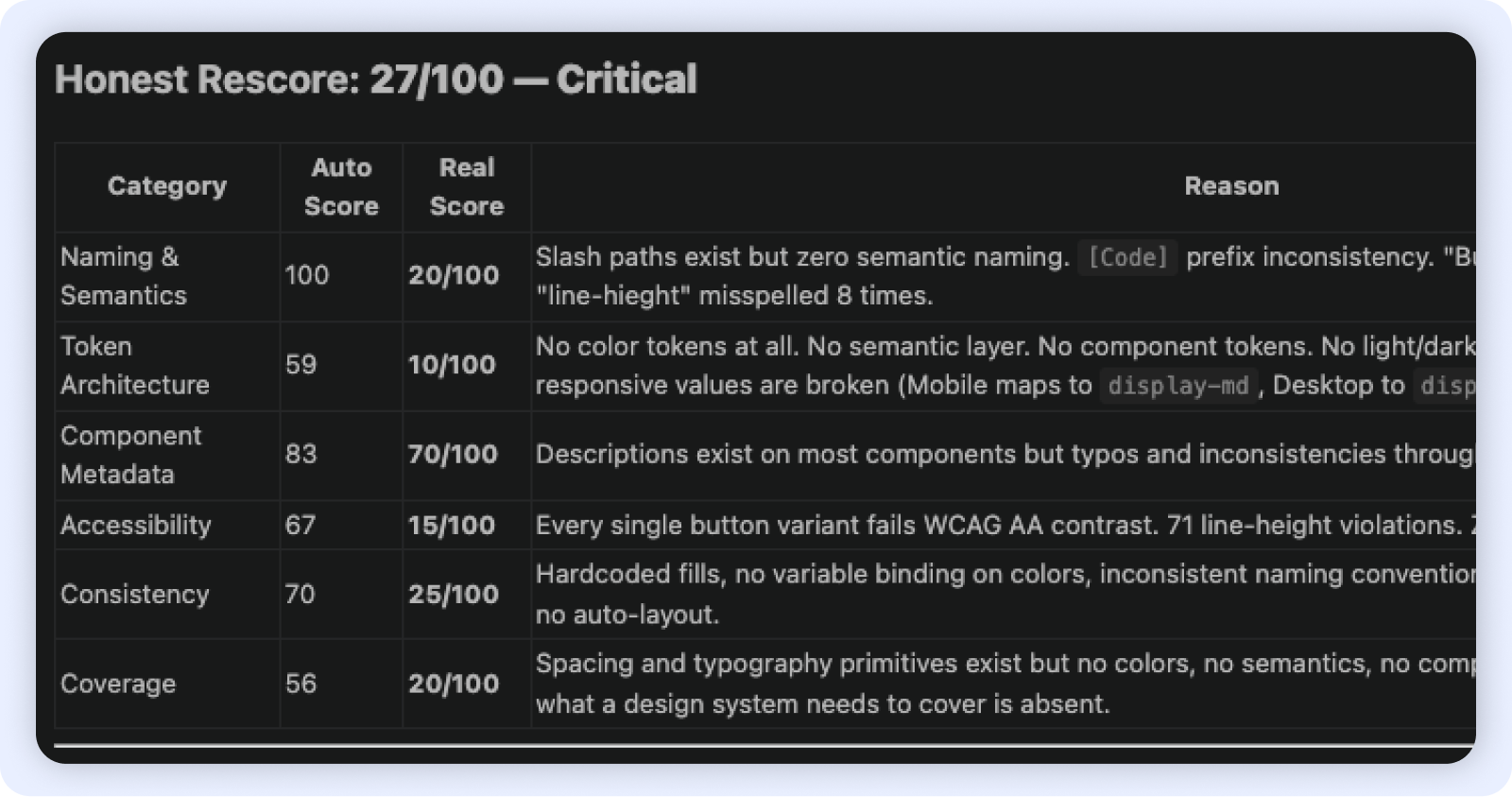
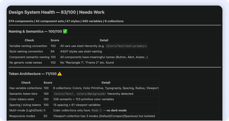
We treated the design system as a product, which meant auditing it like one. On the technical side, I used Claude Code and Figma Console MCP to scan the live DS file and produce an objective health score across 6 dimensions simultaneously (Naming & Semantics, Token architecture, Component metadata, Accessibility, Consistency, Coverage). What would have taken days of manual review became a categorised baseline in hours.
In parallel, I surveyed PO, FE, and QA — the teams who consume the system daily. Their feedback surfaced the workflow friction the tool couldn't see: requirements finalised on the design canvas, developers making implementation decisions independently, QA flagging missing states too late.
Step 2: Product scan
No tool can tell you how a doctor actually uses a screen. I went through the live CMS product with help of AI ( the screens, the tickets, the feedback, the Figma comments left...) After grouping and analysing everything, 2 pain points surfaced consistently:
Every spacing decision, type scale, and layout pattern in Phase 1 was tested against one question:
Does this work for a doctor moving fast, across devices, under pressure?
Step 3: Build — Token architecture + Component library
With diagnosis complete, Leo and I moved to build. I led the token architecture: separating the two previously merged product libraries, establishing a primitive-to-semantic token hierarchy, and defining spacing, colour (206 semantic + 123 primitive variables across 6 collections), corner radius, and typography rules grounded in the clinical constraints we'd identified.
Every naming and structure decision was made with AI-readiness as a forward constraint — semantic hierarchy and consistent slash naming are prerequisites for any design-to-code pipeline. For responsive coverage, we prioritised the teleconsultation screen and the most-used 2-column layouts by usage volume rather than attempting full coverage. Leo built and published 574 components against the new token foundation.
Outcomes
Phase 1
Separated product libraries. Token foundation: 450 variables, 6 collections. 574 published components. Consistency at 80%. Responsive framework for high-traffic screens. AI-ready naming and token hierarchy.
Future phases
Concept validation and speed to market. Getting Aiko in front of real users quickly so we could collect behavioral data no prototype could give us.
Closing
This project started as a design system cleanup and became a structural intervention — in both the system and the organisation around it. By combining an AI-assisted technical audit with cross-functional research and direct product scanning, I could diagnose the governance problem and the technical debt simultaneously, then sequence fixes that protected delivery while building durable infrastructure. The token architecture was designed from the start to be AI-ready: semantic hierarchy, consistent naming, and a coverage framework with defined slots for Phase 2. A team of 2 delivered what would typically require a dedicated design systems team — because we used AI where it had leverage, and human judgment where it didn't.


Rebuilding a healthcare design system for AI-ready delivery
The CMS is a clinical tool designed for doctors. But for years, it shared a design system with products that had nothing in common with it. Designers patched the gaps locally, quietly building a second system in the shadows. By the time we inherited it, nobody knew what existed, where it lived, or whether it could scale. So we rebuilt it from the ground up, with a team of 2 and AI doing the heavy lifting on audit and measurement.
27 → 83
Design System Health Score
80%
Consistency Score
23.96% → 90%
Design System adoption rate
Role
Design SystemStrategy & systems thinkingAI-assisted workflow
Team
2 Designers (Joelle & Leo)PM & POFront-end Team
Timeline
8 weeks
Problems
The CMS at MaNaDr isn't a typical product. Its primary users are doctors — clinicians who multitask constantly, scan dense information at speed, and switch between devices mid-consultation. Their interaction patterns, visual expectations, and tolerance for ambiguity are fundamentally different from a standard consumer interface.
But the design system didn't reflect this. The CMS shared a library with the company's other products — including a public-facing website with entirely different design conventions, information density, and interaction patterns. Two products with nothing in common as experiences were treated as one system.
In practice, no team had the bandwidth or authority to fix this. So designers patched locally — creating components on the fly, building outside the shared library, storing everything in a way only the person who built it could navigate. Over time, the CMS accumulated a shadow design system: duplicated components, no naming convention, no structure, invisible to anyone new.
Our process
A team of 2 with AI
With only two designers and a product launch deadline, we split clearly by leverage. I owned everything upstream: diagnosis, architecture, and the structural decisions that would determine how the system scaled. Leo owned downstream execution: translating those decisions into a built, published component library, because he knows the system more than me.
AI wasn't optional, it was how a team of 2 did the work of a team of 5. We used Claude Code with Figma MCP to run the audit, scan the live file, and re-measure progress at the end of Phase 1. Without it, the audit phase alone would have taken weeks of manual review.
Step 1: Audit with AI + Cross-functional survey
We treated the design system as a product, which meant auditing it like one. On the technical side, I used Claude Code and Figma Console MCP to scan the live DS file and produce an objective health score across 6 dimensions simultaneously (Naming & Semantics, Token architecture, Component metadata, Accessibility, Consistency, Coverage). What would have taken days of manual review became a categorised baseline in hours.
In parallel, I surveyed PO, FE, and QA — the teams who consume the system daily. Their feedback surfaced the workflow friction the tool couldn't see: requirements finalised on the design canvas, developers making implementation decisions independently, QA flagging missing states too late.
Step 2: Product scan
No tool can tell you how a doctor actually uses a screen. I went through the live CMS product with help of AI ( the screens, the tickets, the feedback, the Figma comments left...) After grouping and analysing everything, 2 pain points surfaced consistently:
Every spacing decision, type scale, and layout pattern in Phase 1 was tested against one question:
Does this work for a doctor moving fast, across devices, under pressure?
Step 3: Build — Token architecture + Component library
With diagnosis complete, Leo and I moved to build. I led the token architecture: separating the two previously merged product libraries, establishing a primitive-to-semantic token hierarchy, and defining spacing, colour (206 semantic + 123 primitive variables across 6 collections), corner radius, and typography rules grounded in the clinical constraints we'd identified.
Every naming and structure decision was made with AI-readiness as a forward constraint — semantic hierarchy and consistent slash naming are prerequisites for any design-to-code pipeline. For responsive coverage, we prioritised the teleconsultation screen and the most-used 2-column layouts by usage volume rather than attempting full coverage. Leo built and published 574 components against the new token foundation.
Outcomes
Phase 1
Separated product libraries. Token foundation: 450 variables, 6 collections. 574 published components. Consistency at 80%. Responsive framework for high-traffic screens. AI-ready naming and token hierarchy.
Future phases
Concept validation and speed to market. Getting Aiko in front of real users quickly so we could collect behavioral data no prototype could give us.
Closing
This project started as a design system cleanup and became a structural intervention — in both the system and the organisation around it. By combining an AI-assisted technical audit with cross-functional research and direct product scanning, I could diagnose the governance problem and the technical debt simultaneously, then sequence fixes that protected delivery while building durable infrastructure. The token architecture was designed from the start to be AI-ready: semantic hierarchy, consistent naming, and a coverage framework with defined slots for Phase 2. A team of 2 delivered what would typically require a dedicated design systems team — because we used AI where it had leverage, and human judgment where it didn't.